Rural Teach
Reading into rural teachers’ needs with research-backed findings

Tool
Adobe XD
Miro
Duration
12 weeks
Role
UX Researcher & Designer
I worked on a team of 5 in a user research and design capacity to help bring a platform supporting rural teachers come to life. The project lead had first hand experience of burnout and wanted to use his skills to make a difference. Figuring out how to do so without making a one-stop shop meant figuring out key user needs, which involved extensive research with fascinating focus pivots.
Problem
The current version of RuralTeach was described as a hub for teachers living in communities where it is hard to find access to other teachers due to their location. To actualize into a platform, RuralTeach needed to focus on three key features of immediate need.
Outcome
We designed features which emphasized a core desire for teachers: connection. Our designs focused on curriculum collaboration in a centralized place online, otherwise spread out through different social media platforms.
Orignal Problem Statement:
Teacher turnover affects student advancement.
User Research
Cold calling
I began soliciting research participants by researching a few districts and emailing to one teacher from each. I requested a phone call and if possible, referral to another teacher. While I had only waited for three days from three teachers, I began feeling nervous and asked my group if they thought LinkedIn was an appropriate source to solicit interviews. I researched over twenty districts and not a single person responded to my connection request or message explaining my projects’ purpose.
In the meantime, I researched Facebook groups related to rural teachers and educators in general (as long as the group had over two thousand members, perhaps making it likely some in there were rural teachers). I private messaged the moderators of general teacher groups and did not receive a response. When there was one week left, I decided to post on a public group specifically for rural teachers (“I am a Rural Teacher!” which had less than a thousand members) requesting interviews and compensation for people’s time. I felt the offer was acceptable as I have engaged in user research for similar compensation.
Scheduling was difficult with a few people so for them, I sent a survey which documented the research questions my group devised. I also added the survey to my initial post. It was disappointing to see that 16 people demonstrated some interest and I messaged 13 of them, but I only received five respondents overall. Two phone interview participants and one survey participant opted out of payment.
I collected information from six users; three in the form of interviews and three in surveys. All participants were rural teachers.
User Interview Findings
I collected information from six users; three in the form of interviews and three in surveys. All participants were rural teachers. They were asked about their likes and dislikes with professional development, mental health, and teacher networking/connection resources.

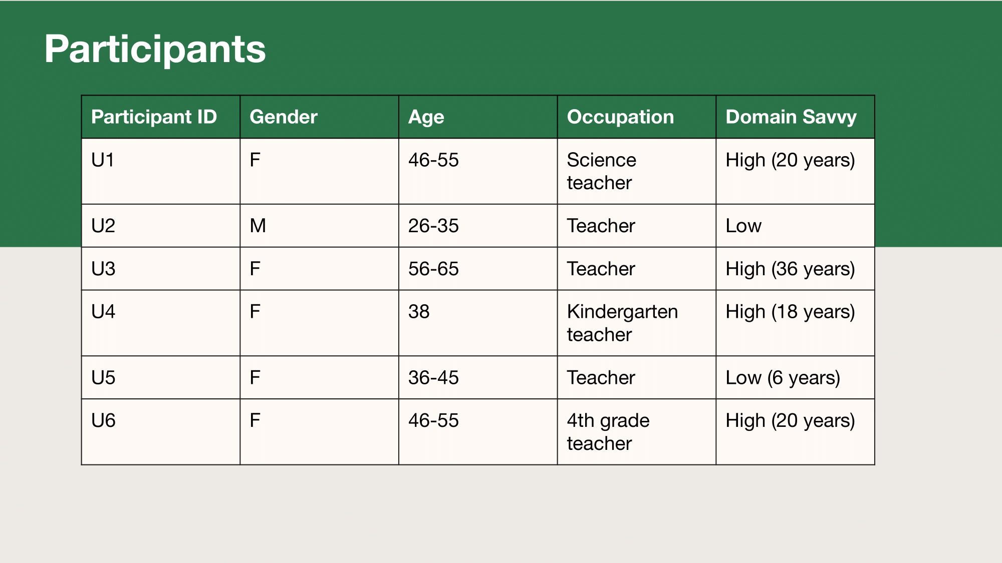
Demographic information of participants.
Mental Health
- 5 teachers rate the importance of mental health at a 9 or above (1 rated it as a 7)
- 3 participants said mental health days were considered personal days.
- 3 participants used personal days related to mental health reasons. 2 used personal days for themselves, another used one to go take their daughter to the funeral of a classmate who died by suicide.
- 2 participants attended a funeral of a student (by first or second connection) 15 years old or younger who died by suicide.
- 2 participants noted elementary school students were aggressive in the classroom, causing mental distress strong enough to require a personal day
- 2 participants receive mental health support in the form of therapy and/or medication.
- 3 participants meditate as part of self-care (2 of them use Calm.com)
- 2 participants voiced a need for mental health support for students
- 5 participants practiced some form of self care everyday.
- 4 participants considered their colleagues a source of emotional support.
Community
- All 6 participants looked for community and connection.
- 2 participants noted that their teaching community at their school is open about mental health, but fear that other areas (locally or nationally) are not.
- 5 participants felt online resources for teachers provide connection.
- 5 participants noted a downside of online groups are due to its anonymity or the distance between others in the group.
- Online groups may help people feel “less alone,” but do not make up for the human connection they desire and likely brought them to the resource to begin with
- 2 participants feel they don’t have a direct connection with people in the groups they are a part of
- 2 participants feel that the groups are disorganized
Professional Development
- All 6 participants rated professional development at an 8 or above.
- All 6 participants use career development sites, with 5 using rural specific resources.
- 4 participants actively search for professional development.
- 4 participants pay for some form of professional out of pocket.
- 3 participants receive some form of professional development through the school.
School Resources
- 2 participants’ schools government funding is expiring next year.
- One was due to impoverished status and another qualified for COVID support
- “Impoverished status” grant provided for professional development compensation
- “COVID support” grant fulfilled request for more in-classroom help
- 4 participants noted that it is difficult to find substitute teachers and two have to find their own if they want the day off.
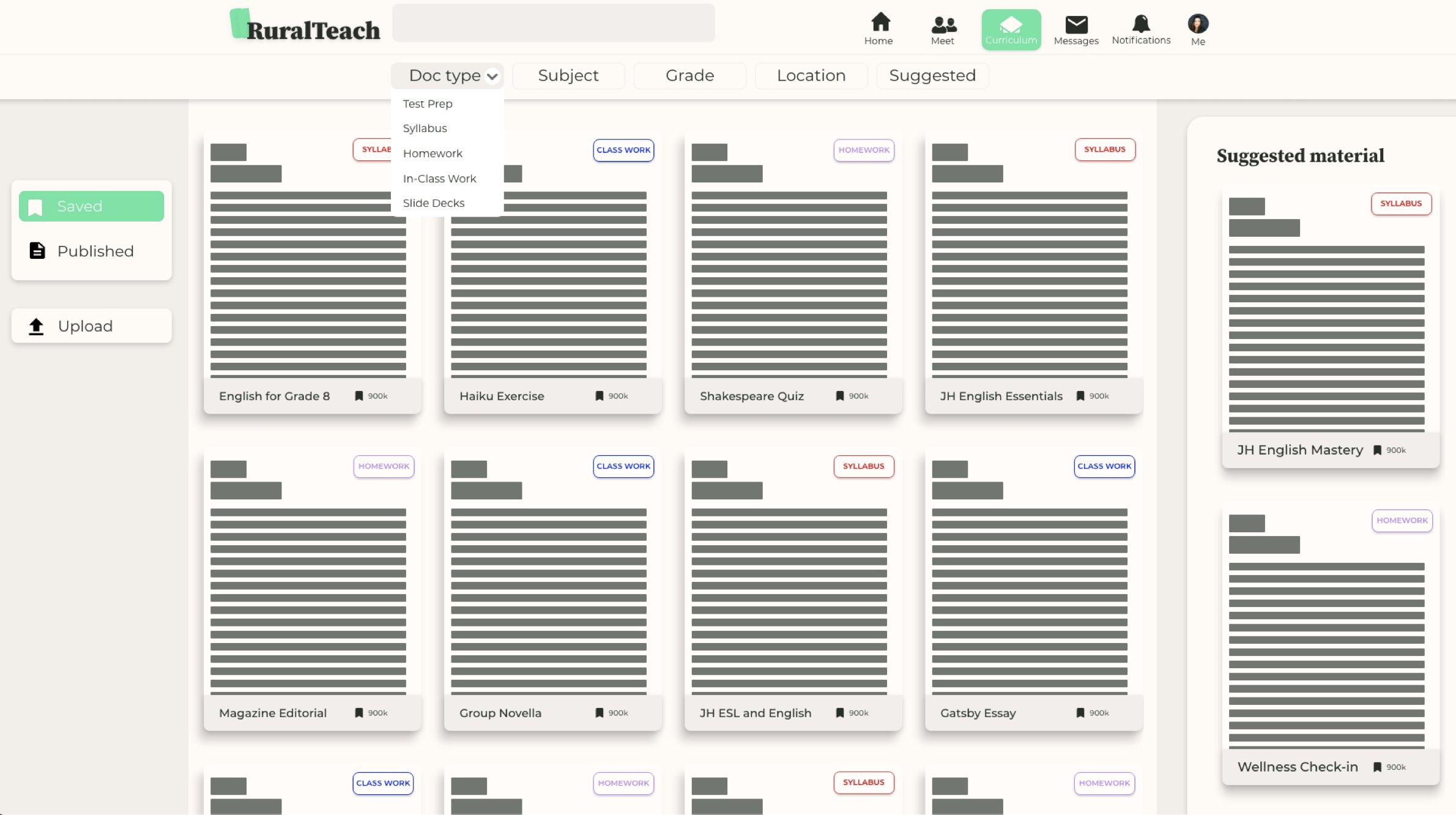
A revision to the original problem statement could be enhanced to reflect the reasons causing teacher turnover:
Absent support systems for teachers risks student growth.
From these findings, my team and I made wireframes, high fidelity designs, and tested them with a select number of users we interviewed for research.
Usability Testing
When approaching usability testing, we shared that we were solving for:
Rural teachers struggling with burnout and lack desired community connections and proper mental health resources.
We interviewed 5 users in the target demographic of teachers, specifically rural teachers.
High level insights:
- Overall it seemed like there was quite a lot of structure that wasn’t very intuitive to the user. Once a user was prompted with the next path it made sense to them, but there were some large pauses as they tried to figure out next steps.
- The highly stylized interface made it difficult for users to differentiate between familiar processes (like uploading a document) and new ones (making a suggestion or asking for feedback).
- While the interface was clean, the interface did not create a sense of community teachers were asking for. (In a sense, more Facebook, less LinkedIn).
The following showcases the screens tested questions asked.
1. User Dashboard

“Show me how you would open a saved document.”
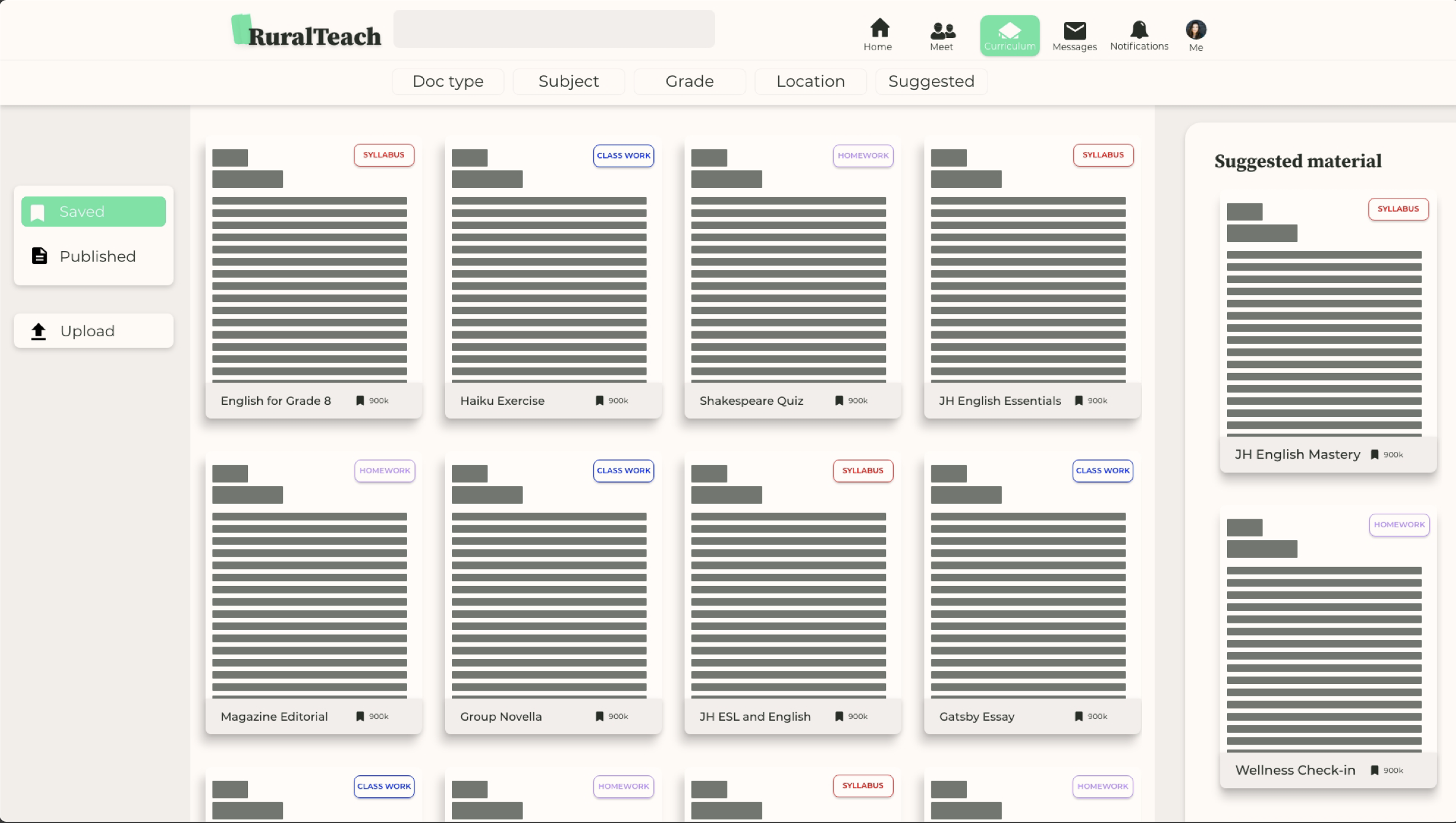
2. Curriculum Viewer

“Show me how you would comment on a saved document.”
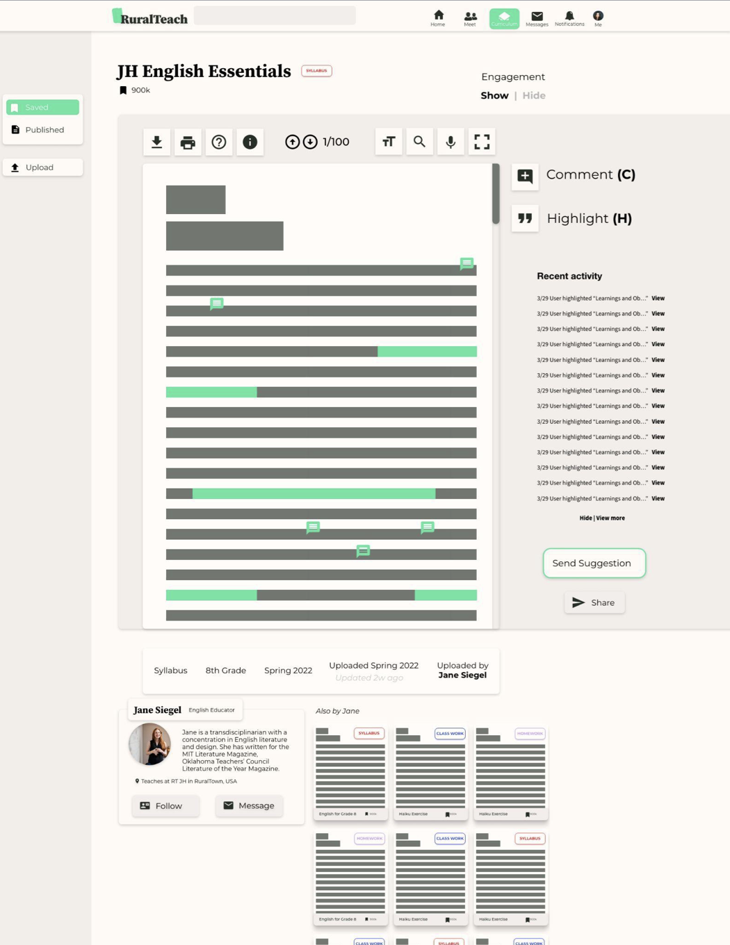
3. Curriculum Comments Overview

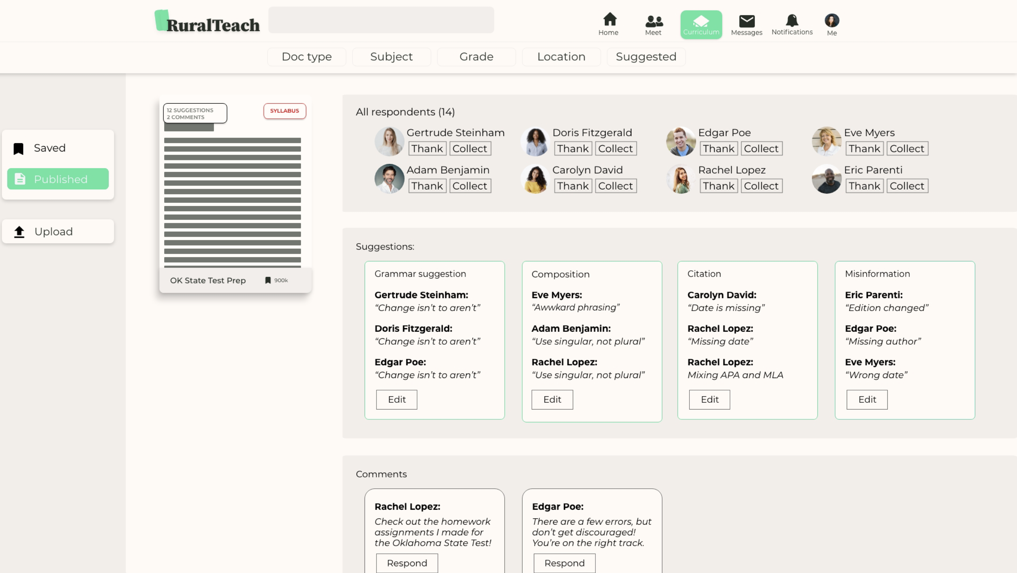
“Show me how you would manage suggestions in a saved document.”
4. Upload Document Modal Flow

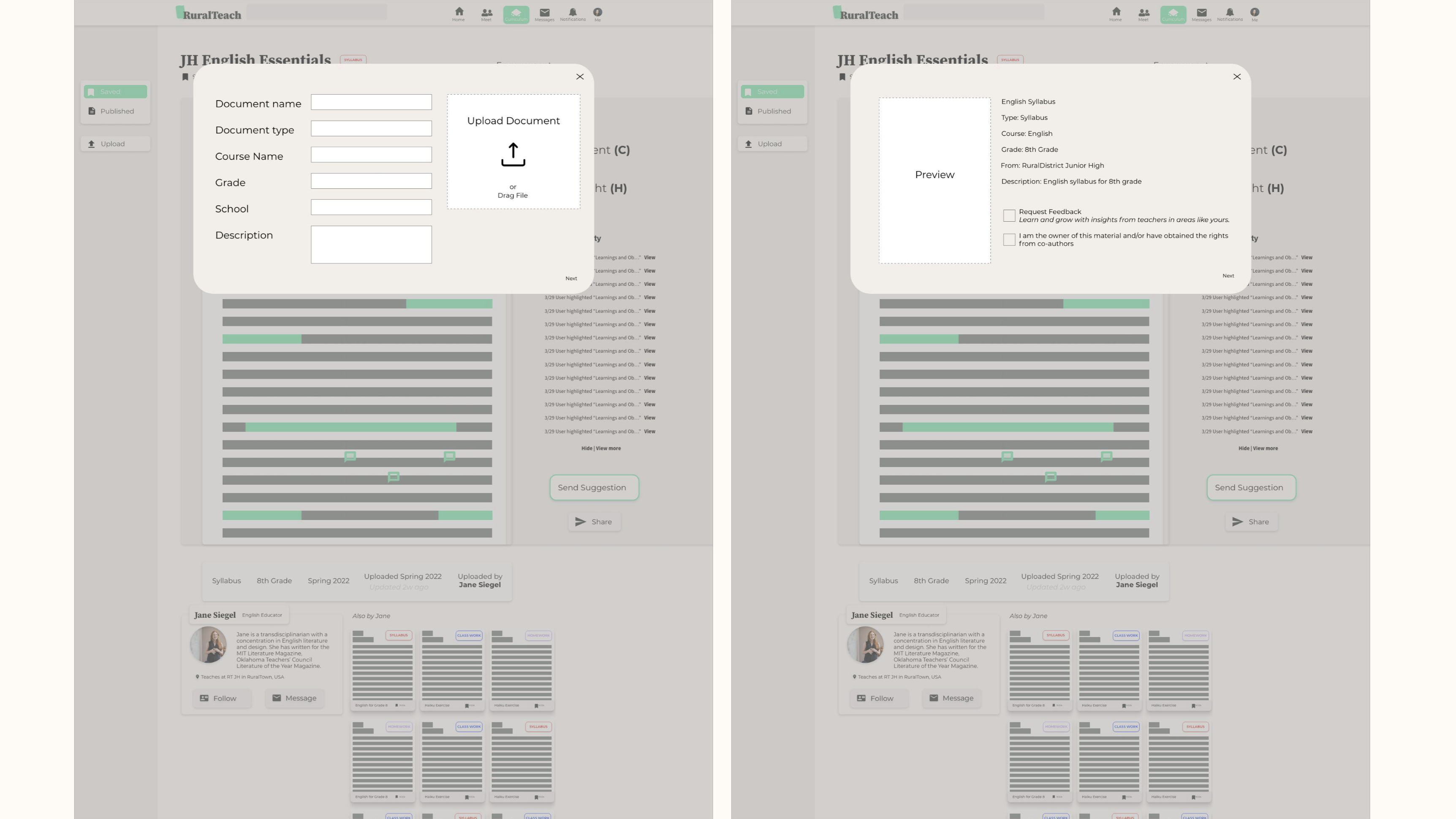
“Show me how you would upload a document.”
5. User Dashboard (post upload)

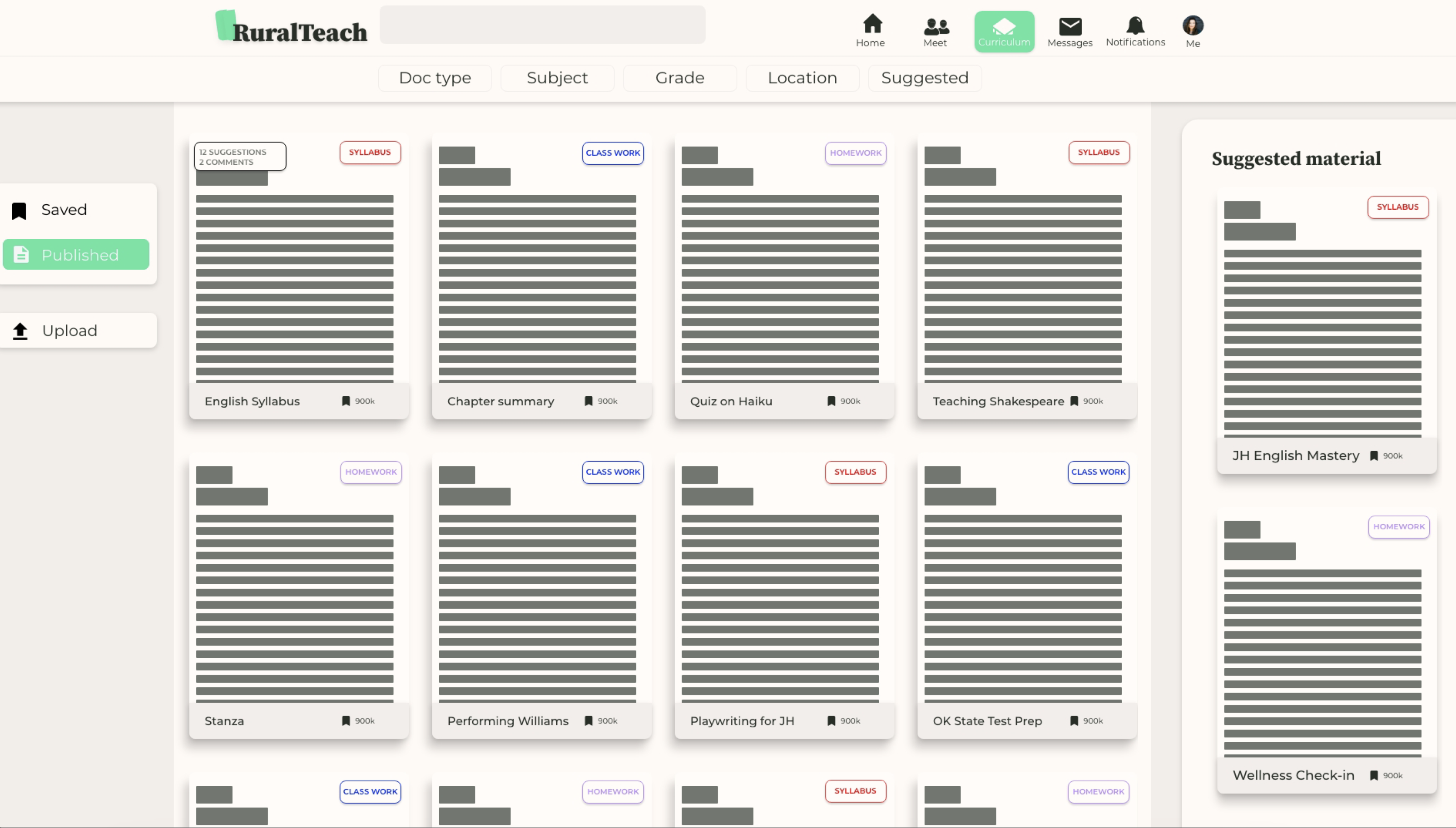
“Show me how you would go about making edits on a published document?”
Insights and Findings
- The bright green, although one of our style guide colors, may be difficult for visually impaired users to see. Specifically the white text on bright green.
- The “edit a document” section seemed confusing to the user and they would have liked to see that as a different icon rather than text.
- The “Engagement” feature (which allows users to view a document without community involvement) was not understood. This posed a problem since a variety of operations were displayed once the toggle was switched to “show.”
- Some user flows were not intuitive as users interacted differently with buttons and the document area differently than expected. To make a suggestion, users interacted with buttons first and the document second. It was assumed that users would note an error in the document before specifying the issue associated with it. This is likely attributed to the lack of text and, therefore, a lack of a particular issue to identify. Had there been mock text, the user may have followed the anticipated flow, but there is still little justification for a user to choose only one method of carrying out an action should mock text not have been part of the issue at hand.
- Perhaps it is the color scheme, text, or content itself, but the upload screen took considerably longer to comprehend than the suggestion function. With the former bearing stronger associations in commonplace applications, the stylized screen may have convinced the user she was using a new feature.
- The interface and its functions appeared so new that even basic functions (like uploading a document) seemed so new. For example, an explanation for a new, but key, feature which is to request feedback on a document from teachers during the upload process was desired.
- While the interface was considered clean and generally easy to understand, it did not communicate a sense of community.
Learnings
After another round of designs, the team debriefed and reflected on the coding challenges our design functionalities posed. It might not have been feasible to develop an in-app document editing tool at this time, but learning that users valued the feature was telling as to what needs they had and could give insight into future ideations about the platform’s viability.